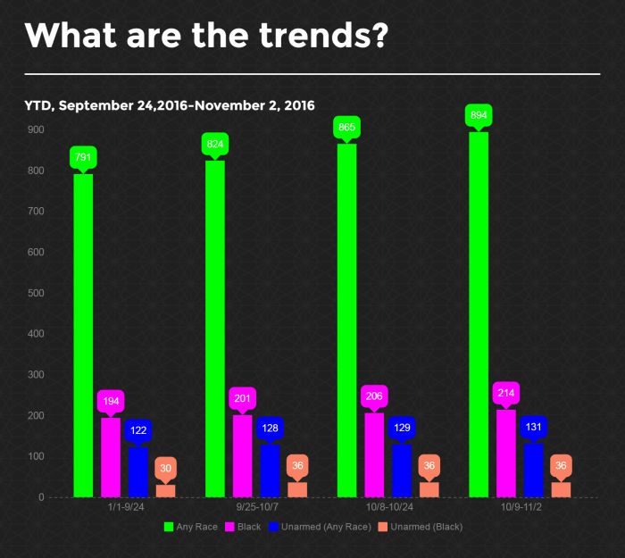
I’ve been posting a graphic like this since September 27th. (Here’s a refresher in case you missed the last three graphs.)
Why?
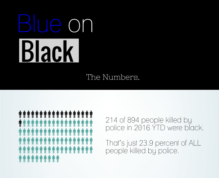
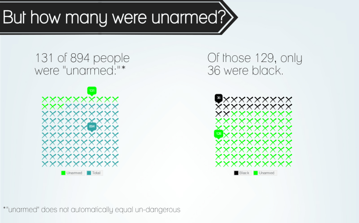
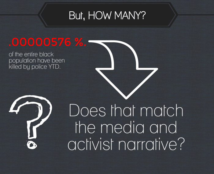
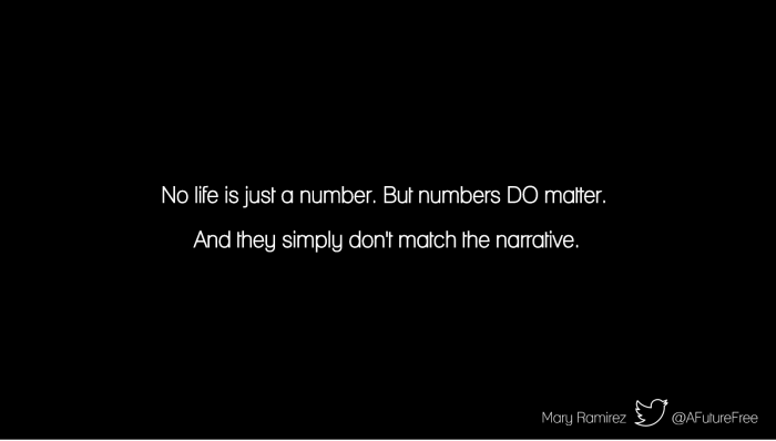
Because the numbers simply do not support the narrative that cops are targeting and needlessly killing African Americans en masse. And you’re not hearing this anywhere.
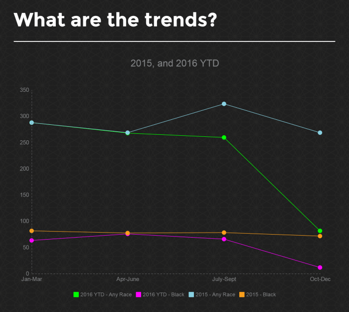
The percentages are virtually the same as the sampling 3 weeks ago (and 2 weeks before that), and they paint a similar message: the media and social justice narrative on Blue on Black deaths is simply false.
But don’t let me sway you – look at the numbers and you be the judge.

Pingback: Black on Blue: The Numbers | A Future Free